At first glance, Android Q might seem like more of the same. After all, it’s nearly identical, UI-wise, to Android Pie. But it’s also bringing so many under-the-hood changes that we can’t help but be excited about it. You could say that Android Q is to Android Pie as Android Marshmallow was to Android Lollipop. A refinement-focused update that, instead of bringing unnecessary UI and UX changes, brings new features, improvements, and changes based on user feedback. Believe me: there’s a lot of stuff to be excited about on Android Q.
Today, we’re doing a deep dive on Android Q’s first publicly available beta to uncover all of the little things and features that Google’s latest OS will be including. This list does not include the features that Google officially shared in their blog post, nor will we talk about any of the new APIs and platform changes that affect developers. This post is all about what Google didn’t talk about it; the changes you have to flash the beta build to see for yourself. We also have a 17-minute video overview covering most, but not all, of the changes we’ve written about below.
System-wide Dark Mode
Possibly the biggest, most anticipated feature of Android Q is a system-wide dark mode. We’ve been expecting this feature to come to Android ever since Android Lollipop introduced Material Design and its blindingly white UI elements in 2014. We got a sneak peek of it during the first Android M betas all the way back in 2015 before it was removed without explanation. Then it came back the next year with the Android N betas, but once again, it didn’t make it to the release version of Android Nougat.Fast forward to another year later and we (sort of) got it with Android 8.1 Oreo: if you set up a dark wallpaper, the notification shade, the launcher, and other UI elements would turn dark as well. With Android Pie, this option became user-toggleable, and users would be able to turn this partial dark mode on and off on demand regardless of their wallpaper’s color. Granted, it was a far cry from an actual dark mode as 99% of UI elements outside of the launcher and the notification shade remained white, but hey, it was better than nothing at all.
While a setting to enable this dark theme was present in the leaked Android Q alpha build we uncovered a couple of months ago, it has since been removed. The reason is unknown, but we’re guessing it’s still in development and they’re hiding it away until it’s more polished. However, this dark mode is definitely still there. It can be enabled by turning on Battery Saver mode, but if you don’t feel like having Battery Saver always on and you have access to a computer (and minimal ADB skills while you’re in that, too), you can toggle it on and off by following this tutorial.
Theming
Android and theme engines have a funny story. Previously, the concept of system themes was reserved to OEM skins like EMUI and TouchWiz and custom ROMs like CyanogenMod. It remained foreign to stock Android users. Then, with the advent of Layers and its successor, Substratum, theming stock Android became a real possibility: by leveraging built-in theming platforms like OMS and RRO, root users were able to theme many aspects of their UI/UX the way they wanted to. This became more accessible as Android Oreo baked OMS into AOSP and the Substratum developers released Andromeda, an add-on allowing non-root users to theme their stock systems.Andromeda’s momentum was quickly cut off with the release of the March 2018 security patch, restricting the installation of overlays to system apps and thus ending rootless theming. A workaround was then found and Substratum theming is currently possible, but it’s definitely not practical for everyone. As of today, AOSP Android does not have a built-in full-fledged theming solution of any kind. This is not changing with Android Q, but at least they are opening the doors to more customization.
System Feature Flags
Android Pie added a new “Feature Flags” page in Developer Options. Android Q retains that page but expands on it with more flags. Here’s a summary of what some of the disabled flags do when enabled (or at least, what we think they do):- settings_aod_imagewallpaper_enabled: Allows the wallpaper to be briefly shown on the always-on display. The Google Pixel 3 has this on Android Pie, but the Pixel 2 does not.
- settings_audio_switcher: Adds a new icon to media playback notifications letting you quickly switch audio output. More info below.
- settings_bluetooth_hearing_aid: Enables you to pair a Bluetooth hearing aid.
- settings_global_actions_grid_enabled: Changes the layout of the power menu.
- settings_mobile_network_v2: Reportedly enables Dual SIM, Dual Standby on the Pixel 3.
- settings_screenrecord_long_press: Enables the built-in screen recorder in SystemUI, accessed by long-pressing the screenshot option in the power menu. More info below.
Media Playback
The most interesting feature flag from earlier, audio switcher, adds a button to media playback notifications (left) that, when pressed, brings up a settings slice that lets you switch audio output (right).| Android-Q-Beta-Music-Playback-Switch-Icon |
 |
| Android-Q-Beta-Quick-Switch-Playback |
Desktop Mode
Android on the desktop is a concept that has existed for years. With projects like Android-x86 and Remix OS, you’ve been able to use Android on a desktop environment for a while now. Recently, however, it has been picking up steam. Some time ago, Chrome OS added Android app support, giving Chromebooks the ability to access the Google Play Store and take advantage of the Android app ecosystem. Additionally, Samsung’s flagship smartphones and tablets come with Samsung DeX functionality—users can plug their phones to a display and unveil an Android-based desktop environment.With Android Q, it looks like a desktop mode similar to DeX could be coming to AOSP Android as well. Right now, it’s not really in a comfortably usable state, but it’s definitely getting there. There is a desktop interface with an app drawer, and you can drag shortcuts into the desktop. Apps are launched in freeform windows, a feature that was first introduced with Android Nougat.
 |
| Android Q’s native desktop mode. |
Accessibility
New Accessibility options have been added to extend the time you can read toast messages and how long you have to take action on them.
If you enable the hearing aid feature flag, you’ll find a new Hearing Aids option in Accessibility Settings.
Battery
Battery Saver based on your usage habits
Battery Saver is immensely useful. By turning it on, background processes are restricted and so is CPU usage, in an attempt to save as much battery as possible. This feature has existed for several Android versions, but with Android Q, it’s getting more useful. As black and darker hues are known for sipping less battery than white themes, the aforementioned dark mode is now enabled with Battery Saver in order to save even more battery.Sounds pretty neat in theory, but we’re yet to see how it will work during actual, real-world usage.
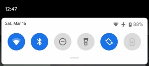
Battery Estimate appears in Quick Settings
If your device is unplugged, you’ll see the estimated time until your device runs out of power (left) if you pull down the status bar. If your device is plugged in, you’ll see the current battery level (right). |
| Android-Q-Beta-Quick-Settings-Battery-Estimate-1-300x131 |
 |
| Android-Q-Beta-Quick-Settings-Battery-Estimate-2-300x133 |
Design Changes
Notch and rounded corners showing up in screenshots
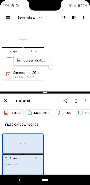
It isn’t a secret to anyone that smartphones have changed radically during the past few years, and as bezels get reduced, things like notches, cutouts and rounded corners are brought up to the table. Nowadays, 90% of current smartphones have some form of screen notch or rounded screen corners—even budget devices. These cutouts and rounded corners are supported by the system as overlays, allowing apps to scale properly and work optimally even with these cutouts, but these don’t show up in screenshots because, well, they’d look weird. Until now, I guess.Your device’s notch and rounded corners will show up when you take a screenshot in Android Q as black space. We’re not sure whether this is intended behavior or not, and I’m personally not sure how to feel about this. Massive notches like the Pixel 3 XL’s are visual disturbances you probably don’t want to look at when you receive a screenshot from someone. But they’ll be there nonetheless. In this beta build, at least.
Looking for examples? Just scroll up.
App Info page redesign
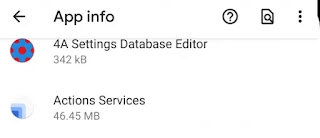
The App Info page has been reorganized and redesigned. There is a new button to open the app directly. Notifications show an estimate of how many notifications the app pushes.
Settings get more Material Theme influence
The Settings app has more of the new Material Theme design influence in Android Q.
Recent app windows have rounded corners
Speaking of rounded corners, recent app windows now have rounded corners to match the Pixel 3’s round display corners. This could be a feature exclusive to Pixel devices.
Small UX Tweaks
Wi-Fi network sharing via QR codes
Wi-Fi networks are something we take for granted nowadays, but unless you have no regard towards your privacy whatsoever, then you probably have a secure home network with a decently safe password. Thing is, it can get pretty annoying (and potentially unsafe, too) to hand over your password to everyone. Android Q introduces a handy solution to this: there is now a “Share” option available on your saved Wi-Fi networks, which brings up a QR code.
This code can be easily scanned by other Android Q users, who will then be instantly connected to that network. The only downside to this is that it is, at the moment, a feature exclusive to Android Q, and will depend on the OS’ adoption to succeed. But nonetheless, it’s pretty neat and actually useful for a lot of use cases.
Built-in screen recording
Previously, the only way to record your phone’s screen was to download third-party apps like AZ Screen Recorder, which take advantage of Android’s screencasting feature to record your screen. While these apps work good enough for most purposes, it’s definitely not something baked into the system and also gives place to a lot of regressions, like the fact that you can’t record internal audio with these apps. Meanwhile, other mobile operating systems like iOS do bring screen recording functionality out of the box.
With Android Q, system-level screen recording is finally coming to Android. A feature flag (see above) must be enabled before proceeding as of now, but once you got that step out of the way, you can access it by long pressing on the screenshot button. In its current state, it seems pretty barebones, with the added obstacle that it is also rather buggy, to the point it might crash on a number of devices. Like every other Android Q feature, this will probably take a bit to reach stable, usable status (after all, this is the first beta we’re talking about), but it probably won’t belong. Sadly, it still records audio using your microphone.
Auto-replies and app actions from notifications
Google has been playing around with the concept of auto-replies since Allo (RIP) was first announced. The content of the message is analyzed by Google to then generate contextual answers that can be quickly sent by tapping on them. This feature has made its way to other apps like Messages and Gmail, and last year, they even launched an experimental app bringing those smart replies to your notifications.
This functionality will be built into Android Q: message notifications will now show these smart replies whenever applicable, with no need for a third-party app.
Depending on the message’s content, you may not only get auto-replies. In some cases, this feature may pull URLs to show app action buttons: Ron Amadeo from ArsTechnica showed a couple of examples on Twitter where contextual buttons for opening links on Google Chrome and Twitter showed up right in the notification.
Has anyone else on Q seen this?
For a minute URLs were getting pulled from my incoming messages and presented as action buttons in the notification panel. They even showed app icons for things like Twitter.
— Ron Amadeo (@RonAmadeo) March 14, 2019
It was amazing but it's not happening anymore. pic.twitter.com/WNLRLg9Dv4
Keep in mind that your mileage may vary with certain apps as it is, after all, still beta software. But once it’s ready for prime time it should prove to be very, very useful.
Revoke permissions during the installation of older apps
In this day and age, online privacy should be among our main priorities, if not our biggest priority. And this is why Android Q also brings up a number of privacy-focused features that allow you to protect yourself. For instance, if an app is yet to implement granular permissions (by targeting an API level older than Android Marshmallow) for some reason, then you can manually toggle off those permissions you don’t like before installing the app.
You can also limit things like location gathering to only when the app is running. This way, you can be sure that an app won’t be doing suspicious stuff behind your back. Additionally, apps won’t be able to randomly launch activity and jump to the foreground anymore, and Google is also imposing limits on apps retrieving sensitive information, like the IMEI and serial numbers of your phone.
We’re fairly sure that more things will eventually come in later betas, but as of right now, it clearly looks like Android Q will be focusing on privacy a lot.
We’re fairly sure that more things will eventually come in later betas, but as of right now, it clearly looks like Android Q will be focusing on privacy a lot.
Files app redesign
Chances are you probably use your phone’s pre-installed file manager or, if you have stock Android, you’re likely using a third-party alternative like Solid Explorer, MiXplorer, or FX File Explorer. Thing is, Android actually has a file manager of its own, but it hasn’t really been promoted a lot. In fact, before Android Oreo, it was hidden away in Settings. It’s also pretty barebones, lacking a lot of features and a decent UI, and while it has received improvements over the years there have been actually rather minimal.
With Android Q, this file manager seems to be getting some love. It has received a Material Theme overhaul, in line with Google’s new design language. Among these Material Theme changes, a full-fledged search bar replaces the action bar on top. Additionally, it’s also getting a filters to feature, allowing users to filter their files by images, videos, audio files, you name it.
It’s still a long way before this is anywhere near other alternatives available on the Play Store, but it’s getting more useful, and a redesign shows commitment from Google into actually making this a viable alternative sooner or later.
Search filtering for Apps & Notifications
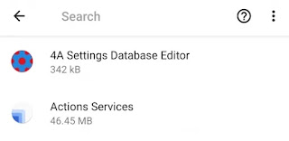
Google has added a search button in the Apps & Notifications submenus to let you find an app you’re looking for much quicker.
Bell icon for new notifications
You can usually see which notification just arrived by looking at the time stamp, but Android Q makes it even more obvious with a little bell icon. The icon is shown for only 30 seconds, but it will help users to know which notification just buzzed their pocket.
New Notification Behavior and Action
This is one change that may be divisive among users. In Android Pie, you can snooze any notification by swiping slowly to the left or right. This reveals the snooze icon and a shortcut to notification settings. You can also remove the notification by swiping left or right, as we have for years. Android Q changes all of this. Swiping left will reveal the snooze icon and the option to block notifications. You can only remove the notification by swiping right.
Android Q also adds new options for long-pressing notifications. In Android Pie, it shows “Stop notifications” and “Keep notifications.” Android Q shows buttons for “Block, Show silently,” and “Keep alerting.” The shortcut to App Info is still there.
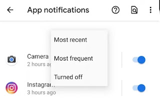
Sort app notifications to see which have been blocked
Android Pie removed the ability to sort app notifications by “Turned off.” This functionality has returned to Android Q.
“Undo” action for the Pixel Launcher
If you accidentally remove an app icon or widget from the Pixel Launcher home screen, there is a new prompt that has an “Undo” button.
Do Not Disturb rearranged
The Do Not Disturb settings page has been simplified. There used to be three main sections, but now it’s organized into just two. Exceptions to Do Not Disturb are grouped on their own page. Schedules can now override the default Do Not Disturb rules if the user chooses.
Miscellaneous Changes and Bug Fixes
Android Q is also bringing some other stuff that, while may not be noteworthy of a section by themselves, they’re still really important. These are:
- There is a new subtle vibration when selecting text and plugging the phone in for charging.
- Android Beam is gone, as expected.
- Notifications
- A new “hide silent notification status icons” automatically hides ongoing notifications that don’t make custom sounds.
- SystemUI Tuner now has a new “show low-priority notification icons” option.
- Dialer
- The power menu now has a quick shortcut to the emergency dialer.
- When you end a phone call, the end call tone is now much softer.
- A feature we thought would come in Android P has now shown up in Android Q: more call blocking options. If you give the Google Phone app the Dialer role, you should see new options to block calls from unknown, private, and payphone numbers
- Developer Options
- You can now switch between game drivers from Developer Settings > Game Driver Preferences.
- Support for enabling ANGLE on a per-app basis has been added. Read more on ANGLE.
- Freeform multi-windows can be enabled in Developer Options without using an ADB command.
- “Trust agents only extend unlock” option, which lets whatever smart unlock option you have set upkeep your device accessible for longer. However, if your phone is locked, then the smart unlock option won’t automatically unlock your phone.
- “Lock screen when trust is lost” option, which prevents revoked smart unlock options from unlocking your device by automatically locking your screen.
- Privacy
- The new privacy submenu gives you quick access to change privacy settings for Google Play apps and services. Settings such as the Autofill service, google location history, Ads, and Usage and Diagnostics can be found here.
- Adjusting the volume in Settings no longer makes a noise.
- Navigation
- Swiping right to change apps now works on the entire navigation bar, not just on the home pill.
- Lock Screen ChangesAlways on Display now shows the song you’re currently playing.
- Always on Display is now located under Settings > Display > Lock Screen Display.
- The “Now Playing” feature on the lock screen has been redesigned.
- Certain app actions can now appear on the lock screen, too.
- Double-tap-to-wake unlocks straight to lock screen instead of to ambient display. for







LifeStory: SEO, SEM, blogging, Tip's, Latest, Review
SEO, SEM, blogging, Tip's, Latest, Review, affiliate marketing, social media marketing, how to earn money with blogging, Entertainment, Breaking News, Health Tips, LifeStory, Video, News, Sport, Trailer, WorldNews, Tips, and Tricks, Social Media. All information Provided